All around, business executives depend widely on information and investigation for basic leadership. With the gigantic measure of information that is being produced by people, organizations, frameworks and so forth., it is winding up noticeably progressively complex for officials to bode well from the colossal information that is available to them. Encourage, information alone is ordinarily not valuable to the leaders unless it is broke down, deciphered, sorted out and introduced in an outwardly engaging way. A great deal of people and organizations make utilization of assorted perception instruments to make noteworthy diagrams. While there are various apparatuses accessible in the market for information representation, Google Charts emerges from multiple points of view.
Below are two screenshots representing a table of data with numbers and a visual representation that table.
Google Charts, when integrated with SharePoint, can be immensely useful to business executives and other knowledge workers to dramatically improve their ability to comprehend and present information utilizing interesting visualizations. Data can be visualized in SharePoint in different ways. Below are some of the options:
- SharePoint Services along with any JavaScript API (Chart.js, Google Charts, Highcharts, D3.js etc.)
- Chart Web Part (Depreciated from SharePoint 2013 onwards)
Integrating Google Charts in Sharepoint
Follow these steps to visualise data using Google Charts API in SharePoint.
Step 1
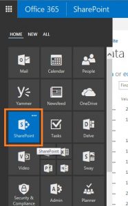
- Log in to Office 365 and navigate to your SharePoint site.
- The first step is to create a web page in SharePoint where you intend to showcase Google web charts. Below is the process to create a web page in SharePoint.
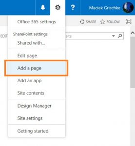
- Click on the ‘Settings’ icon and then select ‘Add a page’. Give a preferred name to the web page and save the page. In this illustration, we have named the web page as ‘Charts Demo’.
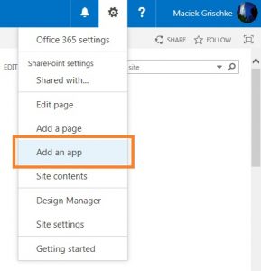
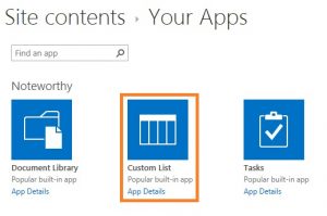
- The next step is to create a new ‘Custom List’. Here’s the process to create a ‘Custom List’: Click on the ‘Settings’ icon available on the top right corner of your browser and then select the option ‘Add an app’.
- Then click on the ‘Custom List’ component displayed on the Site Contents screen.
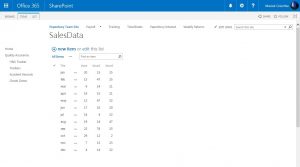
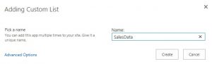
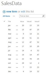
- Provide a unique name to the custom list. Here, we have named the custom list as ‘SalesData’.
Step 2
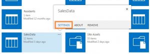
- Visit your ‘Site Contents’ page by clicking on the Settings > Site Contents and ‘SalesData’ tab and then edit the ‘custom list’ as shown below.
- Rename the title column depending on your preference. In this case, we have renamed it as ‘Month’.
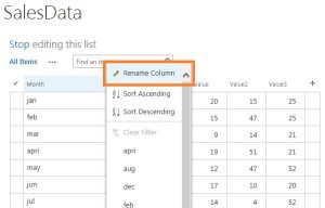
- Click on the ‘+’ button to add new columns (number type). Here, we have added three new columns titled ‘Value1’, ‘Value2’ & ‘Value3’.
- Subsequently, you can add data to the list by clicking on ‘new item’ or ‘edit’ options.
- Add ‘SalesData’ custom list to the ‘Charts Demo’ page.
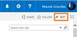
- Go the ‘Charts Demo’ page and click on the ‘Edit’ option available on the right side of the page.
- Click on the ‘Insert’ tab and then select ‘Web Part’ and select the list, click on the ‘Add’ button and save the web page.
Step 3
There are two methods to include Google Charts API in SharePoint
- Method 1 – Download the dependencies and save these in ‘Site Content’ > ‘Site Assets’
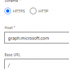
- Method 2 – Include dependencies directly using the below URLs. In our example, we have followed this method.
Dependent Libraries
https://www.gstatic.com/charts/loader.js
https://cdnjs.cloudflare.com/ajax/libs/jquery.SPServices/2014.02/jquery.SPServices.min.js
Adding the code snippet to the web page in SharePoint
- Go to the ‘Charts Demo’ page and click on the ‘Edit’ option (top right side).
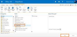
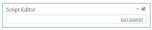
- Add the ‘Script Editor’ to the page by following the below instructions (refer to the below screenshot).
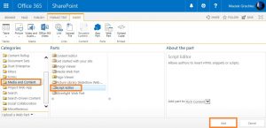
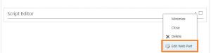
- Click on the ‘Edit Web Part’ option as shown below.
- Copy and paste the code snippet in the ‘Web Part’ and click on the ‘Insert’ button and save the page.
<html>
<head>
<script src="https://www.gstatic.com/charts/loader.js" type="text/javascript"></script>
<script src="https://code.jquery.com/jquery-3.0.0.min.js" type="text/javascript"></script>
<script src="https://cdnjs.cloudflare.com/ajax/libs/jquery.SPServices/2014.02/jquery.SPServices.min.js" type="text/javascript"></script>
<script language="javascript">
var returnedItems = null;
function loadGoogleLibAndDraw(){
 google.charts.load('current', {'packages':['bar','line']});
 google.charts.setOnLoadCallback(visualizeData);
}
function visualizeData() {
 var context = new SP.ClientContext();
 var list = context.get_web().get_lists().getByTitle(document.getElementById('customListName').value);
 var caml = new SP.CamlQuery();
 caml.set_viewXml("<View></View>");

 returnedItems = list.getItems(caml);
 context.load(returnedItems);
 context.executeQueryAsync(onSucceededCallback, onFailedCallback);
}
function onSucceededCallback(sender, args) {
 var data = new google.visualization.DataTable();
 data.addColumn('string', 'Month');
 data.addColumn('number', 'Value');
 data.addColumn('number', 'Value2');
 data.addColumn('number', 'Value3');
 var enumerator = returnedItems.getEnumerator();
 var markup = '';
 while (enumerator.moveNext()) {
 var row = [];
 var listItem = enumerator.get_current();
 row.push(listItem.get_item('Title'));
 row.push(listItem.get_item('ed45'));
 row.push(listItem.get_item('ca4tfee'));
 row.push(listItem.get_item('5f456g4e'));
 data.addRow(row);
 }
 var options = {
 chart: {
 title: 'Sales Trend',
 },
 bars: 'vertical'
 };
 var barChart = new google.charts.Bar(document.getElementById('BarChart'));
 barChart.draw(data, options);

 var lineChart = new google.charts.Line(document.getElementById('LineChart'));
 lineChart.draw(data, options);
}

function onFailedCallback(sender, args) {
 var markup = '<p>The request failed: <br>';
 markup += 'Message: ' + args.get_message() + '<br>';
 displayDiv.innerHTML = markup;
}
</script>
</head>

<body onload="loadGoogleLibAndDraw()">
 <form name="metricsform" id="metricsform">
 <input id="customListName" name="customListName" value="SalesData" type="hidden"/>
 </form>
 <div>
 <div id="displayDiv"></div>
 <div id="BarChart" style="width: 900px; height: 500px;"></div>
 <div id="LineChart" style="width: 900px; height: 500px;"></div>
 </div>
</body>
</html>
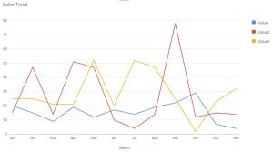
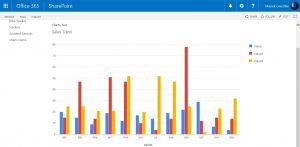
- After the page is saved, the screen will automatically reload and display the chart based on the data. Below are a few sample graphs generated using Google Charts.